Aiding in the prevention of avoidable blindness
Visilant Website Redesign
Project Overview
Currently presented as a landing page, the website requires a comprehensive redesign to better communicate the organization's vision, achievements, and the human stories behind its impactful initiatives.
Goals:
User-Centric Design: Craft an intuitive and user-friendly interface that ensures a seamless navigation experience for visitors, encouraging them to explore the organization's mission and impact.
Content Enrichment: Transform the existing landing page into a multi-dimensional website with dedicated sections, partnerships, and the technology-driven solutions that propel the organization's mission forward.
Build Credibility: Establish trust and credibility by showcasing the organization's achievements and partnerships.
Responsive Design: Ensure that the website is accessible across various devices, catering to a diverse audience and enabling easy engagement from different regions and demographics
Tools: Figma, Zoom, Miro, Trello, Photoshop, Slack, Discord,
Empathy
Empathy
Proto-persona
Our design team created a proto-persona to humanize and better understand the potential users of Visilant’s website.
We can then use this reference point for decision-making throughout the design process.
Research
Research Objective
Identify and address pain points in the nonprofit's website UI to enhance user experience.
Research Questions
What are the user’s needs and expectations
What challenges does the user have using the navigation?
Does Visilant have obvious brand identity?
Is the current content engaging for the audience?
What are some of the websites pain points?
Methods
Conduct user interviews to find the pain points of the website.
Competitive Analysis/Heuristic Evaluations: Conduct a focused evaluation to pinpoint areas of difficulty or frustration, to make strategic improvements for a more user-friendly and effective digital platform.
Stakeholder Contact
Contact: Jordan Shuff - Executive Director
Google Form
Notes from stakeholder
Strengths
Showcasing technology and use
Impact feature
Clean and simple
Weaknesses
Underdeveloped
Lack of communicate of how hospitals are involved in the process
‘About Us’ credibility
Donations
User Interview Plan
Research Objective: Identify pain points in the website's UI and improve it for the benefit of the nonprofit.
Goal: Conduct 4 User Interviews to target user pain points regarding website navigation and connection to the organization’s mission
Tasks for User interviews:
1. Determine the purpose of the organization
2. Contact the Organization
3. Find information on the organization’s technology
4. Find impact statistics - determine which is most powerful
5. Find information about the organization
User Interviews
4 User interviews were conducted
Feedback
Layout is simple and clean
Mission is clear but organization doesn’t present themselves as a non-profit in the about section
Lack of human connection
Pain Points
Lack of an emotional connection with the mission
Website intentions are not clear
Landing page layout lacks credibility
Interview Insights
Our UX design team transcribed qualitative data from user interviews onto these notes, we created a dynamic representation of user feedback while also facilitating a seamless comparison across multiple interview sessions.
Affinity Diagram
Our team systematically categorized and grouped similar ideas, observations, and pain points. This visual framework empowers us to discern patterns and overarching themes, providing a holistic view of user experiences.
Interview Analysis
Insights
A notable concern was that the unintuitive navigation requires excess scrolling in the current landing page layout. Feedback from our user interviews highlights a potential friction point that needs to be addressed to streamline user journeys and enhance overall usability
The user’s uncertainty about how they could interact with the organization through the site is also a concern. This points to a need for clearer communication and guidance, to ensure that users understand and can easily engage with the content.
We aim to keep the design clean and consistent as is represented in the original design. Leveraging this positive note while addressing navigation and engagement issues is the key in optimizing the overall user experience for the site.
Impactful Takeaways:
The current site had an unintuitive navigation that required extra scrolling
Users were unsure how they could interact with the organization
User thought the design was clean and consistent
User Insight Statement
Dr. Patel wants to spread affordable eye care to rural areas and is interested in using Visilant's technology to do so but is having difficulties navigating the single page website using the header to find information, and connecting with the company's mission statement.
Empathy Map
User Persona
After reviewing the stakeholder’s contact form and conducting user interviews we were able to create a user persona that encompassing the ideal user.
Definition & Ideation
Definition & Ideation
Problem Statement
Our nonprofit's website faces usability challenges, including an unintuitive header, awkward scrolling, and a lack of features hindering user engagement and mission communication. How can we enhance usability and accessibility to transform our website into an effective tool for fostering empathy, engagement, and support for our mission?
Value Proposition Canvas
Create an intuitive navigation menu
Increase emotional engagement with the company mission
Heuristic Evaluation
Key Takeaway
Visilant’s target audience and user engagement is not clear from their website.
Competitor Analysis
Key Takeaway
What distinguishes organizations from the majority is their ability to foster emotional connections and humanize their interactions.
Prioritization Matrix
Priority
Humanize the organization
Button Accessibility
Consistent Branding
Clear Mission
CTA in the header
User Scenario
Our team created a user journey map and storyboard to provide an overview of the user’s interactions, emotions, and touchpoints throughout their journey to help us identify opportunities for improvement.
Task Flow
The current design does not consist of a way to solicit donations on Visilant’s website
Our team created a task flow to showcase specifics to identify key interactions and decision points.
User Flow
The flow demonstrates the process of donating and completing the contact form.
Card Sorting
Our team structured Visilant’s site information into cards to help develop mental models and preferences for site organization.
Site Map
Existing Landing Page
Multi-page redesign
Prototype & Testing
Prototype & Testing
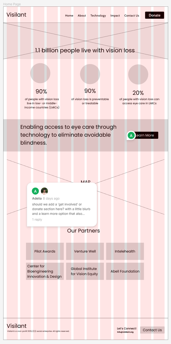
Lo-Fi Wireframes
Guerrilla Usability Testing Plan
Usability Tests
5 User Tests
Script: Hello, my name is [moderator], and I’m going to walk you through today’s session. As I mentioned over email, my class is currently working to redesign a non-profit website and we chose Visilant, a non-profit aiming to reduce avoidable blindness in low-middle income countries with technology. I’d like to begin by thanking you for making time to speak with us. Your feedback is valuable and will help us determine if our website functions as intended. Just to confirm, we’d like to keep this session to 10 minutes. Does that still work for you?
Lo-fi user interview
“I thought I was on the homepage but I’m not”
Test Analysis
Pain Points
Margins
Card size
‘Learn More’ (needed to be linked to a specific page)
Forms need iteration
Margins
‘partners’
are too big
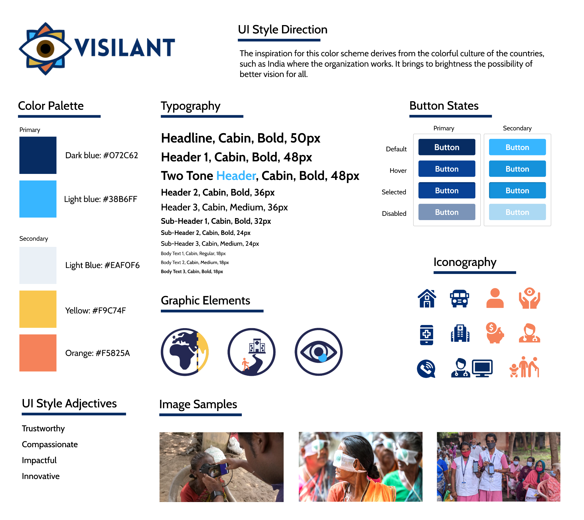
Style Tile
Style Guide
Hi-Fi Usability Testing
Tasks for testing:
1. Make a Donation
2. Find the team
3. Click on “Learn More”
4. Technology Page
5. Contact Page
“maybe the logo should be a link instead of multiple clicks to get to the home page”
A/B Testing
Metrics: Click through rate (CTR) of the home page
Variations:
Version A: Clicking a dedicated home button
Version B: Clicking the logo to navigate home
Random Assignment
Conclusions: Version A significantly outperformed version B
Iterations were made to reflect the outcome of A/B testing
Testing a dedicated home button
Usability Test Analysis
Desktop
Users need a confirmation page after filling out forms to reduce confusion and to be consistent with the industry
Expand payment options by adding alternative methods to accommodate a wider range of preferences.
Mobile
For improved accessibility the logo should be linked to ‘home’
we need to create a larger closing button in the navigation menu for accessibility
Language needs to be simplified for a broader audience
Breadcrumbs would eliminate confusion about the user’s current page
These thoughtful improvements collectively contribute to a more user-friendly and accessible digital experience.
Iterations
Pages were separated into categories to provide clarity
We added bios to the founders to humanize the organization and provide transparency which was a priority based on research.
Before
After
Iterations
Providing information on impact, not only statistics.
Moving the ‘learn more’ button to the home page and linking it to the technology page.
Before
After
High Fidelity Clickable Prototype
Mobile Figma Prototype
Desktop Figma Prototype
Future Opportunities
✔ Present case study to our stakeholder for further investment in the redesign
Showcasing positive outcomes or patient testimonial page to provide credibility and create an emotional connection
Add other form of contact
toll free number
Calendar of events
Donation button in footer
Final Thoughts
The redesign journey for Visilant was more than just a visual transformation; it was a commitment to transforming lives. Shifting from a simplistic landing page to a comprehensive multi-page website was about creating an immersive experience for users passionate about accessible eye care and the mission to eliminate avoidable blindness.
We infused humanity into the organization by sharing compelling stories, humanizing the cause, and fostering a genuine emotional connection with our users. By turning the spotlight on the people behind the mission, we aimed to bridge the gap between the digital space and the real impact on lives.
The introduction of a donation feature serves as a vital bridge between empathy and action. Now, users can seamlessly contribute to the cause they believe in, directly supporting the noble efforts of Visilant.
Through thoughtful design choices, we can amplify the voice of those who need it most and drive impactful change.
“Your interest in exploring this case study is greatly valued. Thank you for your time and consideration!
Adelia


