Rooted in success,
powered by Grounded.
Grounded provides an intuitive interface for gardeners of all levels, offering personalized guidance from plant selection to care. Tailored to users' locations and preferences, its extensive database ensures they can easily overcome gardening challenges.
My Roles
UX/UI Designer, Product Designer, Web Developer, UX Researcher, Data Analyst
Grounded Team Members
Adelia Valadez, Julianna Turner, Erin Wynd
Tools
Trello, Gantt, Figma, VS Code, GitHub, Canva, Photoshop
Problem
Despite the widespread appeal of gardening, many people feel intimidated when it comes to starting their own garden. The thought of taking tiny seeds and turning them into thriving plants can be intimidating, leaving individuals unsure of how to get started.
Our Solution
The Grounded app has a user-friendly interface which empowers those from different gardening backgrounds to dive in confidently. From plant selection to nurturing, the app guides every step tailored to the user’s location and preferences. Its comprehensive database equips them with everything needed to tackle gardening challenges effortlessly.
User Research
User Research
Understand your audience.
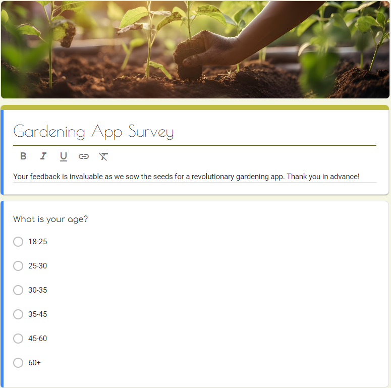
To understand user preferences, behaviors, and pain points, our team developed a survey.
We collected quantitative data from a diverse user base compiled of 33 potential users to help identify common challenges, feature preferences, and usability issues.
Experience
Results.
69.7% are beginner gardeners
75.8% are interested in gardening fruits/vegetables
Only 33.3% were interested in landscaping plants
84.9% say they have less than 3 hours a week to dedicate to gardening.
The most popular way to search for gardening information is through online searches
The most intimidating parts of gardening are the planning and maintenance aspects
39.4% of users were severely opposed to premium features in a gardening app.
Garden App Interest
Responses
Level of Interest
Subscription Interest
Responses
Level of Interest
Would you be willing to pay?
“Oh absolutely NOT”
Only 6% of survey participants said they would pay for premium features.
88% were interested in ultra-personalized gardening recommendations.
Most interviewees mentioned watering plants as a persistent gardening issue.
The concept of soil sensors is born:
Smart devices for your garden
Paid feature/product with demand
Use moisture, ph, sunlight, and nutrient measurements to provide optimum planting recommendations
Send automatic plant care reminders
Interviews
“We have to figure out what to put in there, because I know it’s not just the dirt.”
Our team developed a research plan and conducted 6 user interviews to better understand our users.
Key Takeaways
All participants expressed difficulty in decision-making and planning, emphasizing the need for visual aids and credible information.
Reminders are highly valued across the board, indicating a strong desire for assistance in task management.
Interest in smart devices varies, with some participants open to a wide range of applications while others focus on specific tasks like pest control or maintenance.
Concerns about the complexity, reliability, and cost of smart devices are prevalent, suggesting a preference for user-friendly, affordable solutions.
Empathy & Definition
Empathy & Definition
Proto Persona
Our design team created a proto-persona to humanize and better understand the potential users of Grounded.
We can then use this reference point for decision-making throughout the design process.
Interview Insights
Overall, the key insights highlight a demand for user-friendly gardening solutions that use smart technology to streamline tasks and provide valuable information.
Participants are motivated to enhance their gardening experience through technology but seek solutions that address their specific needs and concerns.
Affinity Diagram
Our team systematically categorized and grouped similar ideas, observations, and pain points. This visual framework empowers us to discern patterns and overarching themes, providing a holistic view of user experiences.
Empathy Map &
User Persona
After reviewing the user interviews and survey results, we were able to create a user persona that encompasses the ideal user of ‘Grounded’ our mobile app.
User Insight Statement
Lindsey Johsnon
“I’m looking for a gardening app that understands my frustration with not finding tailored advice for my garden’s specific needs. I want a single, reliable source where I can effortlessly access all my gardening information without drowning in endless searches. I spend hours researching gardening methods and often feel overwhelmed by the sheer volume of information. I long for a resource that caters comprehensively to my needs as a beginner gardener.”
Problem Statement
Current gardening apps fail to effectively address the needs of users like Lindsey Johnson, who struggle with fragmented information and uncertainty about garden preparation and maintenance. Users find it challenging to access personalized advice for their garden's unique conditions and often forget or lack clarity on regular garden maintenance. This leads to inconsistent care practices and suboptimal plant health. There is a critical need for a gardening app that consolidates comprehensive guidance, offers tailored maintenance recommendations, and simplifies the gardening process to ensure optimal plant care for both novice and experienced gardeners.
Value Proposition Canvas
Goals
Create Convenient and accessible garden resources
Increase gardening confidence and enthusiasm
Competitor Analysis
Competitors are geared towards beginners, have limited information, and lack customization and accessibility.
Ideation
Ideation
Brain-storming
Our team performed this exercise to help identify what aspects of current designs work well (I like), uncover areas that need improvement (I wish), and encourage innovative thinking for potential improvements or new features (What if).
Feature Prioritization Matrix
We created a feature prioritization matrix to evaluate and rank the importance of various features for our project. This tool helps ensure that our development efforts are focused on delivering the most valuable and impactful features first.
Priorities:
Smart device connection
Assistance for planning
Suggestions for maintenance
Personalized recommendations
User Scenario
Storyboard & User Journey
Our team also created a user journey map and storyboard to provide an overview of the user’s interactions, emotions, and touchpoints throughout their journey to help us identify opportunities for improvement.
Task Flow Diagrams
Task flows were made to highlight tasks the user will have during use of our mobile application.
The tasks are outlined to help us identify key points in the users journey through using our mobile app.
User Flow
We then moved onto a user flow to showcase specifics that would identify key interactions and decision making points for our users.
Wireframe Sketching
Prototype & Test
Prototype & Test
Lo-Fi Wireframes
Figma Lo-Fi Prototype
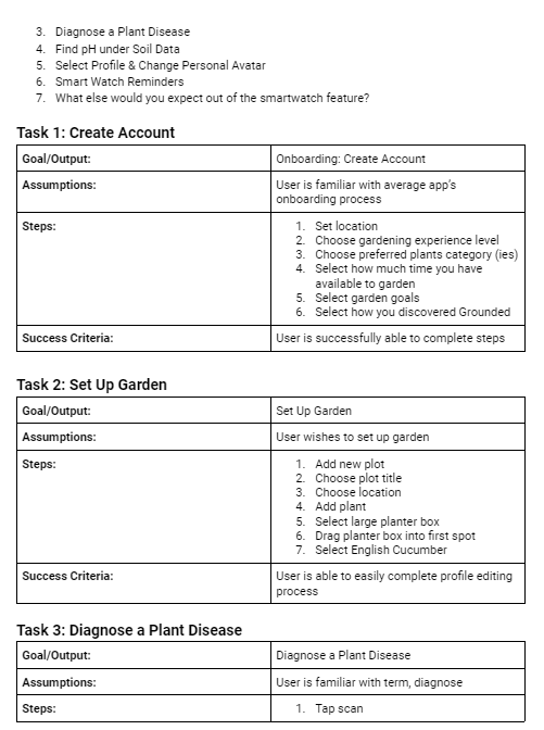
Lo-Fi User Testing Plan
“Well what if I wanted to choose more than one? And now I can’t even go back?”
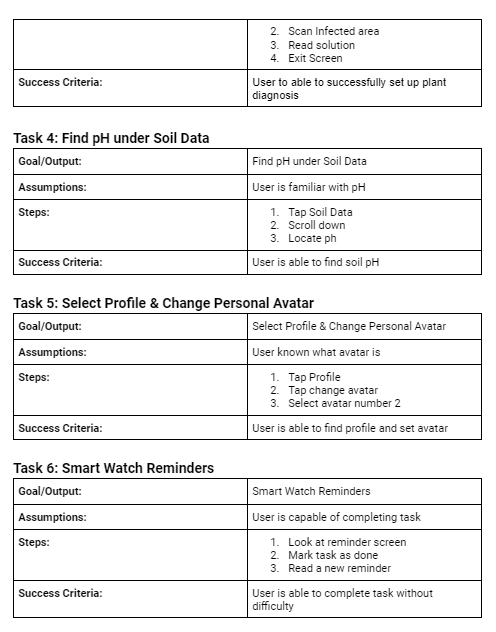
This testing plan was created to put the users through various tasks that could help test the functionality of the mobile app and smartwatch connection.
Key Takeaways
Pain Points
Using the keyboard to go to the next screen (selecting ‘done’) is not intuitive.
A back button in onboarding would be helpful in case a user changes their mind.
Options in some onboarding questions are necessary.
The delay in the smartwatch reminders was too short and did not give ample reading time.
Mid-Fi Wireframes
Based on our low-fidelity interviews, iterations were made to create our mid-fidelity wireframes.
The progress bar in onboarding is now prototyped to take you back to the previous screen.
The next ‘arrow’ button was added to the ‘My Garden’ setup process.
Options were added in specific onboarding questions.
The delay in the smartwatch reminders was increased to give users ample time to read the alerts.
Before Iterations
After Iterations
Hi-Fi Testing Plan
A high-fidelity testing plan was created so that we could test our iterations and prepare to create a high-fidelity prototype.
Styles
Moodboard
A mood board was crafted to serve as an inspirational reference for the app's aesthetic, guiding the infusion of creativity into its visual design.
Style Tile
A style tile was created to define the app's visual elements, ensuring consistency and cohesiveness throughout the design process.
Style Guide
Following the style tile, a comprehensive style guide was developed to provide detailed guidelines for the app's design, maintaining uniformity and clarity across all visual aspects.
Download Style Guide PDF
Hi-Fi Mockup
Testing Feedback
Billing information on purchase stakes page should be auto-filled for consistency
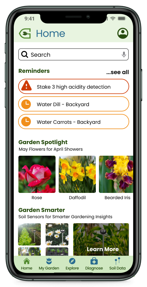
Garden Smarter section on the home page does not look consistent with the rest of the app- could use some improvement
Inability to exit out of reminders on smartwatch makes the user feel trapped
Iterations
Mobile Iterations
Garden Smarter
→
→
Feedback suggested that the ‘garden smarter’ section looked like an add, not part of the app itself so they were deterred from clicking the call to action.
Before
We made iterations to the visual design of the ‘garden smarter’ section to make it more cohesive with the rest of the mobile app’s visual designs.
After
Purchase Complete
New
→
→
Purchasing was updated to have a completion screen after the user has completed a purchase to prevent any confusion in confirmation of payment.
Smart Watch Iterations
After completing the smartwatch task, users felt trapped with no way to continue. To address this, an app icon was added to the smartwatch home screen, allowing users to swipe to it after finishing the task.
A/B Testing
Hypothesis: Placing the search bar on both the homepage and the explore section will improve user engagement and experience.
Version A: Search bar only in the Explore section.
Version B: Search bar on both the homepage and explore section.
Purpose: Gain insights into search bar placement impact on user behavior to optimize app experience.
Testing Feedback
Task Efficiency: Users completed tasks faster with the search bar on the home screen, indicating its positive impact on efficiency.
User Preference: Many users voiced a desire for the search bar to be accessible from the home screen, citing its convenience in navigating the app.
Accessibility: Users valued the search bar's presence on the home screen, aligning with our user insight statement's emphasis on easy access to gardening information.
Conclusion: Retaining the search bar on the home screen is recommended to optimize user satisfaction and engagement, aligning with user expectations for convenience and accessibility.
Key Metrics:
Time taken to find the search feature.
User preference for search bar placement.
Implementation:
Randomly assign users to Variant A or B.
Track metrics over sessions.
Analyze data for engagement, conversion, and retention rates.
Decide on optimal search bar placement based on results.
Version A
Version B
Analytics
Google analytics and Hotjar were set up to our products landing page to track user engagement. Since this site is still very new and only a landing page, not much engagement was seen but it was a great opportunity to test out these analytic tools that will be beneficial in the future.
Future Opportunities
User test for navigation colors
Recipes based on garden produce
Integrate larger landscaping plants
Garden community feature
Adding more pages to the desktop site
Continued testing and iterations
Based on user feedback, I propose running an A/B test to see if color changes are needed. Using blue for buttons instead of green may better align with industry standards, and a white background for the navigation bar could provide a cleaner, more minimalistic look.
“Your interest in exploring this case study is greatly valued. Thank you for your time and consideration!
Adelia


